Talkdesk Explore™ has a new update - the layout. The layout update improves some visual features, without impacting data usage, allowing better performance and a more user-friendly interface.
You can now have a better user experience with the features usability and its aesthetics.
What’s new?
The most noticeable difference is the new layout, more modern and appealing, accompanied by the new font and color.
Default Reports
- Old Layout.
- New Layout.
Default Dashboards
- Old Layout.
- New Layout.
Custom Reports and Dashboards
Keep in mind that each report and dashboard will continue to display all the previously available data. This update is only a visual overall.
What will change in custom reports and dashboards?
We will improve the Create User Interface with a more user-friendly layout, an updated, modern font, and visually-appealing widgets.
The differences you will notice will be in the following sections:
- Create a Report and Dashboard.
- Edit a Custom Report and Dashboard.
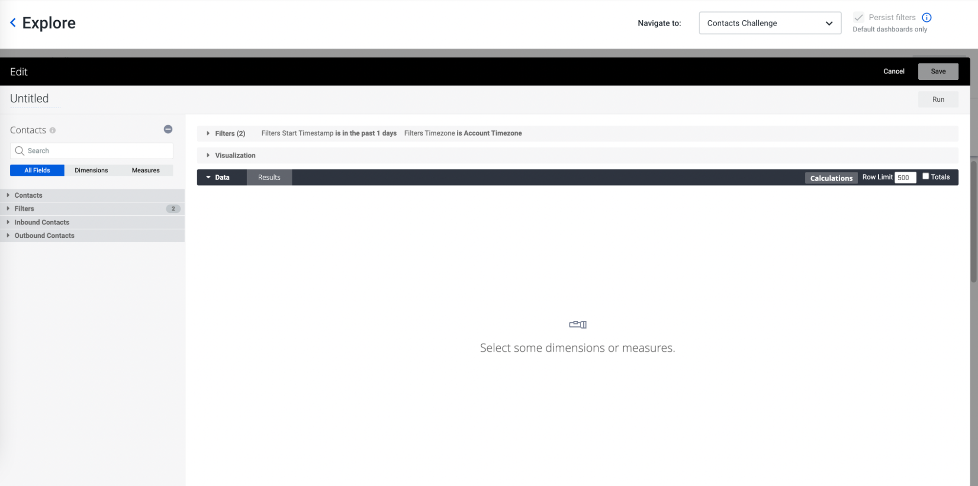
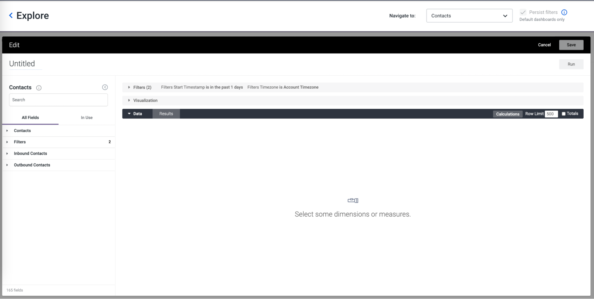
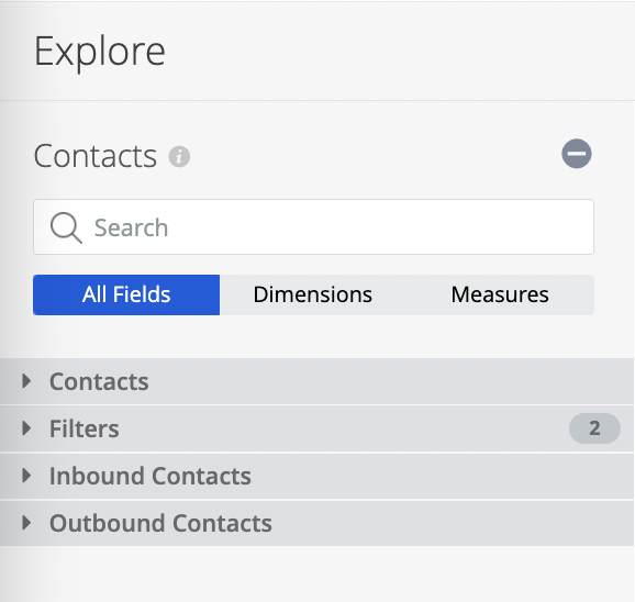
When you set up the report or a dashboard, after choosing the dataset, it is split into a sidebar where you can find the following tabs:
|
Old sidebar layout |
New sidebar layout |
|
All Fields |
All Fields |
|
Dimensions |
X |
|
Measures |
X |
|
X |
In Use |
 |
 |
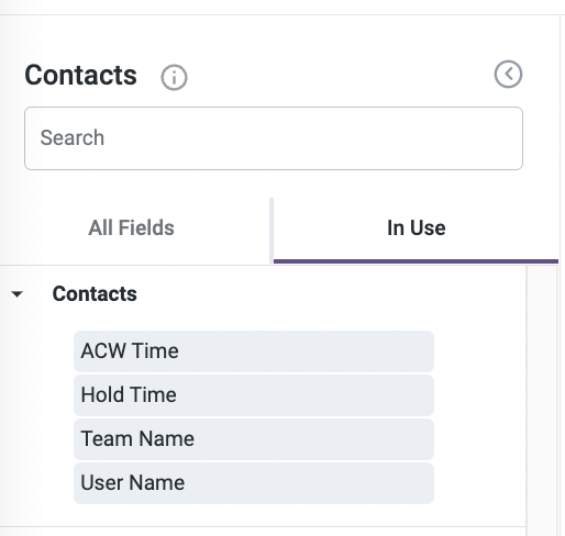
In the new layout, the Dimensions and Measures tabs will be replaced by the new one In Use. The In Use Tab will show all Dimensions and Measures that you are currently using in your report or dashboard, organized alphabetically.
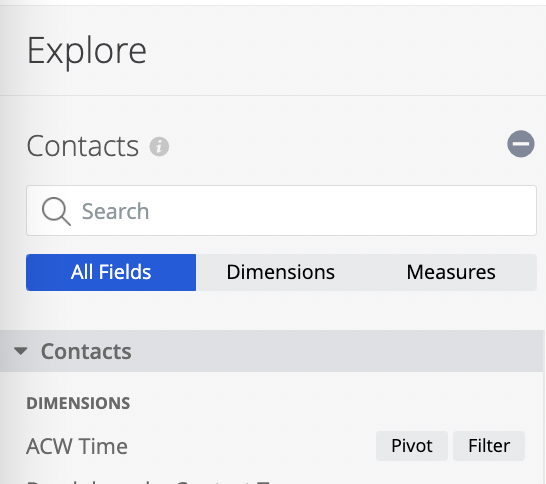
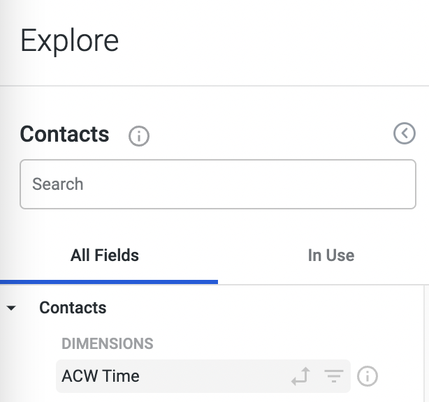
Also, in the sidebar, in each Dimension and Measure we will have the following:
|
Old sidebar layout |
New sidebar layout |
|
Pivot with a text box |
Pivot with an icon |
|
Filter with a text box |
Filter with an icon |
 |
 |
Remember that, depending on the Dataset you’re working with, the filter structure may vary. In some datasets, you will have a specific section with the dimensions and measures that can be used as filters for your analysis.
You can hover over the Information icon to see a description of the measures and dimensions.. However, note that not all dimensions and measures may have a description associated with them, and this will depend on the selected dataset.
|
Tooltip with the Information icon |
|
|
Old sidebar layout |
New sidebar layout |
 |
 |
In the Data section of your canvas, the results will appear in a table format, but in the visualization section, you can adjust the way the results are displayed.
|
Old layout
|
New layout
|
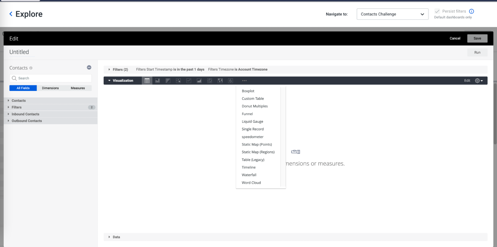
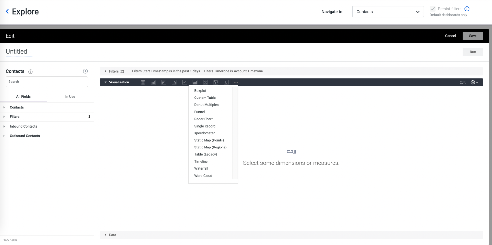
In the Visualization section, the Customizations Visualizations formats available are:
- Table.
- Column.
- Bar.
- Scatterplot.
- Line.
- Area.
- Pie.
- Map.
- Single Value.
- More Options.
There are several visualizations that may only be available depending on the metric combination with the dimension requested. The More Options (three dots) button includes additional ways in which you can display the results, depending on the measures and dimensions you have selected.
|
Old layout |
New layout
|
Notes: No impact is expected, besides small adjustments in User Interface.
For more information, please visit our Talkdesk Explore documentation.
- Explore Custom Create Dashboards.
- Explore Custom Create Reports.
- Default Reports.
- Datasets and the Data Dictionary.
- Editing Options for Visualization Tables.
- Customizing Visualizations.
- Filters and Filtering in Create.


