Service Level Dashboard on Talkdesk Explore™ is a calls' data model metric.
Service Level measures the accessibility of a company to their customers, and the company’s ability to plan for call volume fluctuations and execute their staffing strategy. Service Level has been found to be directly tied to customer service quality and inbound call center performance and, therefore, is often the cornerstone of a call center manager's metrics toolkit for inbound calls.
Service Level is defined as the percentage of calls answered within a predefined amount of time (“target time threshold”). It can be measured over any period of time (i.e. 30 minutes, 1 hour, 1 day or 1 week).
Service Level (as a performance measure) is classified simply as the percentage of calls that were answered in the predetermined time threshold. Service Level has been touted as one of the most important KPIs, as it is intimately tied to customer service quality and overall performance of the call center.
It is only calculated for inbound calls during business hours and considers only calls that are answered and missed (i.e. abandoned calls and voicemails are not taken into account).
Here’s how you can measure your account's Service Level:
- Log into your Talkdesk account.
- Click on the Explore[1] tab.
- Select the Default Dashboard option on the menu tab [2].
- Choose the Service Level [3] dashboard.
5. Configure the filters you wish to apply [4].
6. Press Run [5].
These are the filters available in the Service Level Dashboard:
- Date: Choose the desired time period for your analysis by clicking in the corresponding fields for Date.
- Timezone: By default, the dashboard is using your account Timezone, but you can adjust it to a timezone that better reflects your needs in the Timezone filter.
- Data Aggregation: You can select the time interval by minute, hour, day, week, or month so that the chart displays the data with the chosen aggregation.
- Call Ring Group: By default, the Service Level metrics dashboard tab displays all calls received by your company, but it might be useful for you to only see calls received on specific ring groups.
- Dedicated Line: With this filter, you can opt to keep or remove the calls handled on dedicated lines from the dashboard.
- Phone Number: Similar to when filtering by Ring Group, you might want to narrow your analysis to check the activity for one (or more) of your company’s phone number(s).
Note: If you pick a long timeframe (for example, one month), the full data aggregation at the minute or hour level will not be displayed because the results returned from such a combination are not visually significant. Explore will ignore your selection and automatically pick the best data aggregation (for example, for a timeframe of 90 days, the aggregation will be per week).
For more information, please check the article Filtering Dashboards and Reports.
Inbound Service Level Metrics
Once you set up the filters, the dashboard will display metrics for your selection:
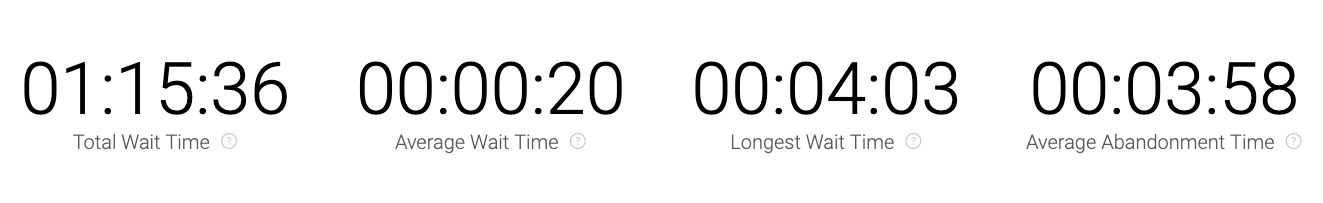
- Total Wait Time: Total time callers waited for their call to be answered.
- Average Wait Time: Average time callers waited for their call to be answered.
- Longest Wait Time: The longest time a caller waited for their call to be answered.
- Average Abandon Time: Average time callers waited for their call to be answered before hanging up (it does not include short-abandoned calls and the hang-up cause is “waiting”).
Note: Previously, the calculation of the Average Abandon Time included short abandons. With the release of the Service Level Dashboard in Explore, short abandons are no longer part of this calculation. This is because short-abandons are not abandoned calls and taking them into account was lowering the average and, consequently, skewing the results.
Below the wait time metrics, you can see the Inbound Service Level metrics:
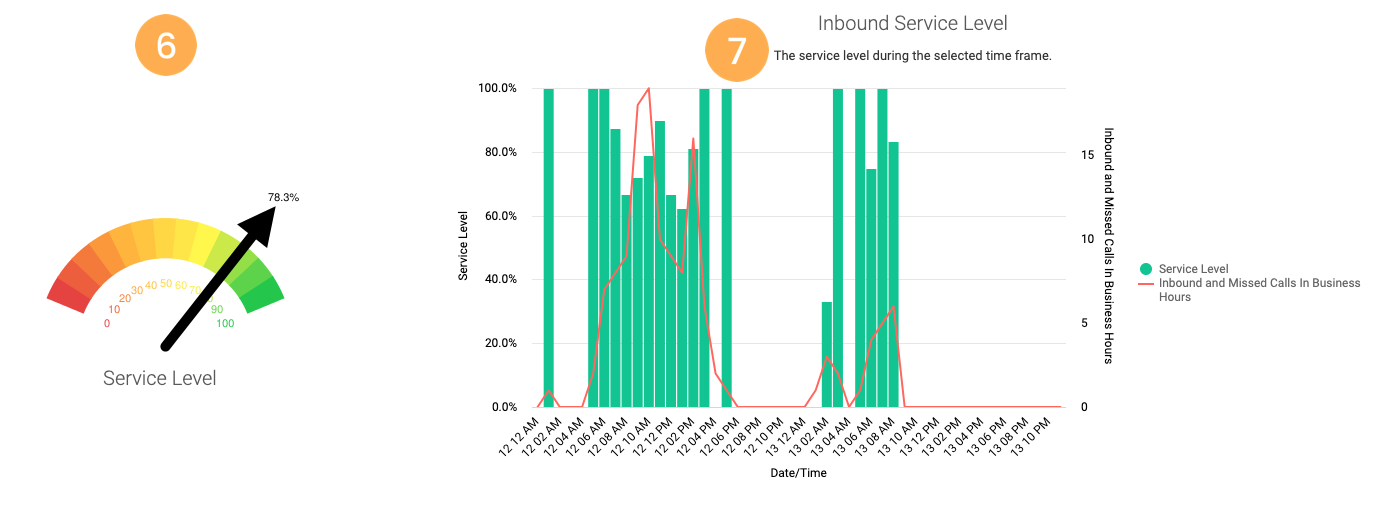
- The gauge [6] shows the percentage of inbound calls that were received and answered within the predefined Service Level.
- The graph [7] shows you how the Service Level has been graded over a period of time. To provide more context, you can also see the distribution of missed and inbound calls for the requested time frame. By using the Date Granularity filter, you can narrow down the results by minute, hour, day, week, or month.
Below the gauge and the graph, you will see the Duration metrics:
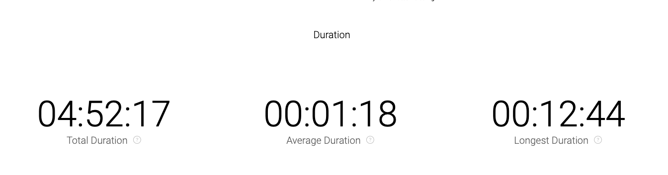
- Total Duration: Total duration of all inbound calls answered.
- Average Duration: Average inbound call duration.
- Longest Duration: Longest inbound call duration.
If you have permission to do so, you can also download the dashboard as PDF or CSV for a more detailed analysis. To do this, simply click the gear icon and choose the desired option. You can also request the report to be sent to specific e-mail addresses and set a schedule. For more information, please check the articles Downloading and Sending Dashboards and Creating Schedules.